How to design top-notch websites (even if you're not a designer)
I've researched and reverse-engineered 10+ status-quo startup landing pages to understand how the heck they design so well.

Igor Krasnik
/
Nov 21, 2023
19 views
1. Fundamentals: keep your landing page layout constrained and simple
Use proven defaults that make your page simple to digest:
Put content into container with limited width (1024px – 1280px)
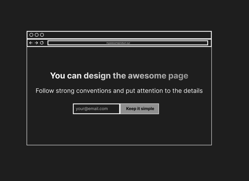
Use 80px or 48px bold font for hero.
Most of the websites use Inter for both title and copy. Use gradient background for your title texts on dark mode.
Use few consistent fonts between all the titles, sections and copy. Line-height and letter-spacing matters a lot for your big fonts.
Keep the copy readable and concise. Never put more than 70 characters in 1 line. For titles it as little as 6-7 words per line.
Keep consistent paddings and margins between sections and elements based on 4px multiplied (or 8px)
Use 12-column structure for the page. Use 2-column, 3-column, 4-column grids for sections.
Use bento grids for feature presentations to make your page look PRO. It's when some items in your grid occupy more than 1 column or 1 row.
Use limited colors (primary accent color + secondary accent colors)
Render media the same way. Put media into gradients background, keep border radius and box-shadows consistent
Use very few and subtle animations. Usually used for hero titles appearance (fade + fly)
Notion keeps their website super simple and unified:

2. Put extra attention into tiny details
Great creators put the effort into each and every section. Each and every piece of data. They want their users to enjoy every section so they do not compromise the details.
Always care about your users first. This is not just cool and genuine, that's how you sell and win loyal customers.
Level up your landing page:
• Make your copy is clean, keep it as short as it can be. Explain the problem, use 7th-grade vocabulary, talk to the readers, tell what's in it for them and guide them to action.
• Choose icons that support your copy. Don't throw random stuff. eg. If you say you "build fast" use "⚡️" or "🏃" but not "🐋". Using icons is simple yet it's important addition to your design.
• Polish Media A LOT (images, video, gifs). That's where great designers put their energy. That's how you stand out without rebuilding your website over and over.
Add subtle backgrounds to make sections pop: use patterns, gradients or photos
Linear makes every section worth sharing:

3. Keep your content data structure simple and unified
The same way as you keep your layout simple, you should keep your data simple to create quality content, move fast and scale.
Turn all your content into database of "sections" made of:
• Title
• Description
• Icon (small monochrome icon)
• Media (Detailed Image or Video)
• Call To Action (text+url)
That's how you build your landing pages even without designing. Call it a zen-mode. Once you declared the structure everyone from the team can understand it and contribute.
This database is all you need to create the beautiful sections like this:

☝️Once you have the data, you can transform any individual section into any examples from above. They all are just different representations of the same data structure.
Is your content unified or you add new weird custom fields for every section?
👉 Start your long-form website from distraction-free database of sections in AirTable or Google Sheets.
👉 Try different common styles for the same section to find creative layouts.
How to design top-notch websites (even if you're not a designer)
Get blog updates to your email

Get designs that drive your sales